Where Visitors Ask "Is This Company Real?" — Page-by-Page Trust Signals
Trust is not one badge. Visitors decide on the homepage, contact page, and footer separately. What should each page carry?

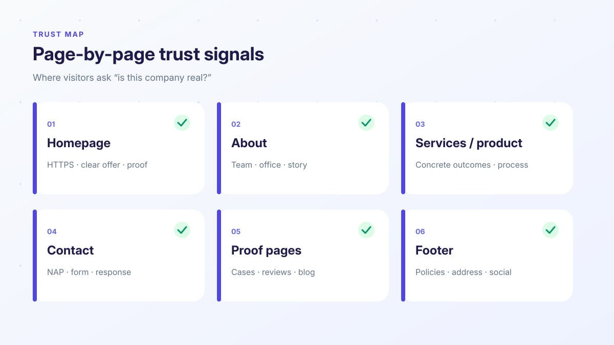
Short answer: visitors do not ask "is this company real?" in one place — they ask on the homepage, about, services, contact, proof pages, and footer. Each page is a separate trust vote. Missing signals stack up; conversion drops quietly.
A polished hero is not enough. The lock icon, a consistent phone number, a real team photo, a working form, and clear policies are not "aesthetics" — they reduce pre-purchase risk. This guide is a page-by-page checklist. Performance lives in Core Web Vitals; machine readability in the View Source test and llms.txt. Here we focus on human trust.
Who you are, where you are, who to write to — is it clear?
Cases, reviews, logo bar, process — the offer made concrete.
Phone, email, form, response time — the fastest "real" test.
HTTPS, no broken links, policy pages, consistent NAP.
AEO sentence: Visitors test whether a company is real on the homepage, about, contact, and footer — separately. Strong trust signal stack: HTTPS + consistent NAP + real identity + working contact path + concrete proof.
1. Homepage: "are they serious?" in five seconds
The homepage carries offer and trust at once. Visitors scan: what you do, for whom, why you, and can I contact you now?
- HTTPS and a clean URL. Without the lock, the trust conversation ends early.
- Clear offer + who it is for. Not a jargon wall — value in one sentence.
- At least one proof block. Logo bar, short case, review, or metric — under the hero.
- Visible CTA + phone/WhatsApp. "Contact us" alone is weak; the path must be obvious.
- Real visuals. Heavy stock + empty copy = template-site feel.
2. About: the identity test
About is not a "we are great" essay. Visitors look for faces, place, story, and accountability. An empty page or mission-only copy grows doubt.
- Team or founder faces. Name + role; real photos when possible.
- Where you are. City, office, or service region — not a vague "global" claim.
- Short story + concrete focus. When founded, who you serve, what you deliberately do well.
- Bridge to contact. One tap from About to the form or phone.
3. Services / product: "do they actually do this?"
A service page should show process and outcomes, not only package names. Visitors want steps, deliverables, and fit — not a slogan list.
- Concrete outcomes. What do you deliver? (site, integration, care…)
- Process steps. Visible stages such as discovery → design → launch.
- Related proof. A case or sector example tied to that service.
- Clear CTA. Quote / discovery call — no hidden form.
4. Contact: the fastest "is it real?" test
Contact is the stress test. If the phone fails, the form 404s, or the address is missing, visitors decide here — often against you.
- NAP consistency. Name, address, phone match site-wide and Google Business Profile.
- Working form. Few fields + privacy consent; a response path, not a spam funnel.
- Response expectation. A line like "we reply within 24 hours" builds trust.
- Map / location. Especially for local businesses; for remote work, state the service region.
- Alternate channel. Email or WhatsApp — reduce single-door risk.
5. Proof pages: blog, cases, reviews
Blog and case pages are not SEO-only. Fresh, concrete content signals "this team is still active." An empty blog or a three-year-old last post reads as abandoned.
- Cases / projects. Problem → approach → result; honest metrics.
- Reviews / references. Name + company (with permission); anonymous "great service" is weak.
- Living blog. Practical guides also feed AEO / GEO.
- Machine side. Keep proof copy in raw HTML — if View Source misses it, AI summaries miss it too.
6. Footer: quiet but critical
The footer repeats on every page. Address, phone, privacy, cookies, social links are not background noise — they are a consistency check.
- NAP again. Must not contradict the header.
- Policy links. Privacy, cookies, terms — no 404s when clicked.
- Real social. Do not link dead or empty profiles.
- Copyright / legal name. Small, but a "legal entity" signal.
7. Common mistakes that look fake
Old phone in the footer, new number on contact; another address on Maps.
No About, no team — only stock offices and "customer-centric" copy.
Form never sends, broken mailto, a "coming soon" page from years ago.
Invented logo walls, nameless quotes, exaggerated 500% metrics.
If the browser says "not secure," good content rarely saves the visit.
Leftover lorem, "Company Name," mixed languages, copyright stuck in 2019.
8. A five-step fix path
- 1. HTTPS + NAP audit. Site, Maps, invoices, social — one correct set.
- 2. Homepage proof band. One case, review, or logo row under the offer.
- 3. Fill About. Face + place + focus; do not leave it empty.
- 4. Test contact. Submit the form yourself; publish a response-time line.
- 5. Footer + policies. Fix 404s; update year and legal name. Then build a case/blog rhythm.
Conclusion: trust is an accumulated UX decision
Short answer: visitors ask "is this company real?" page by page. Offer and proof on the homepage, identity on About, reachability on Contact, consistency in the footer. Gaps stack; one badge does not save you.
Pair trust with performance and machine layers: CWV, View Source, SEO / AEO / GEO, llms.txt.
At Mandalium we clarify the trust skeleton first: NAP, identity, proof, working contact — then conversion and visibility layers. Any trust gaps on your site? Book a free look →
Frequently asked questions
What is a trust signal?
Concrete proof that helps a visitor believe the company is real, reachable, and able to deliver: HTTPS, consistent NAP, real photos, team identity, contact paths, policies, reviews, and case evidence. One badge or stock photo is not enough.
Where do visitors most often ask "is this company real?"
On the homepage (offer + proof), about (identity), contact (reachability), and footer (address, policies, social). On service pages they also ask "do they actually do this?" The decision accumulates across the journey.
What is NAP and why does it matter?
NAP is Name, Address, Phone. It must match across the site, Google Business Profile, invoices, and social profiles. Inconsistency — especially in local search — reads as fake or disorganized.
Do stock photos hurt trust?
Overused, out-of-context stock images create a template-site feel. Real office, team, production, or project photos (cleared and clear) are stronger. If you use stock, keep offer and identity copy concrete.
Is HTTPS enough on its own?
No. HTTPS is a baseline security signal; a browser warning kills trust instantly. But HTTPS with an empty about page, a hidden phone number, or inconsistent addresses still feels fake. Think in layers.
What are the top 5 steps for a smaller business?
1) HTTPS + consistent NAP. 2) Clear homepage offer + one proof block. 3) Real identity on About. 4) Working contact form/phone + response expectation. 5) Policies and address in the footer. Then grow cases and reviews.

Tugay Mandal
Founder of Mandalium. 6+ years of experience in web design, mobile apps and SEO.
About Us