The 8 Pages Your First Website Needs (And 4 Areas You Should Never Leave Empty)
A first website is not a 3-page business card. It needs an 8-page skeleton and 4 filled areas: offer, proof, contact, next step.
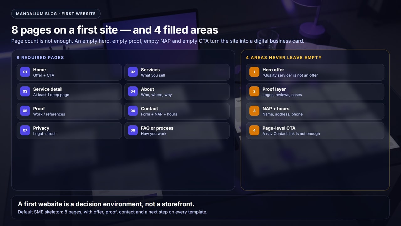
Short answer: a first website needs 8 pages — home, services, at least one service-detail page, about, proof, contact, privacy, and FAQ or process. And four areas must not stay empty: the hero offer, the proof layer, NAP + hours, and a page-level CTA. A theme can look full. If those four boxes are lorem, “coming soon,” or stock phrases, the site is a digital business card.
In the field most first sites launch with three pages: home, about, contact. There is a slider, a line about “quality service,” an 11-field form, and a phone number lost in the footer. That structure covers “we have a website.” As we wrote in the small-business guide, the real job is to write the offer and the required pages first, then pick a platform — not the other way around.
Decision work needs its own URL. A three-page card will not carry a service query.
Offer, proof, NAP, CTA. Every empty box is a leak a theme cannot hide.
An empty blog is not page 9. It is a thin page. If you have nothing to write, leave it out of the nav.
Offer in 5 seconds, a tappable phone number, a working form, a privacy link.
1. Why 8 pages — why not 3?
A three-page site feels familiar because it copies the printed brochure. In 2026 the buyer looks for you in Google, on Maps, and in an AI summary at the same time. SEO, AEO, and GEO need distinct URLs and citable sentences. Home cannot carry every intent.
- Service intent needs its own page. “Manisa web design,” “CNC turning quote,” “villa renovation” will not fit on home.
- Proof does not fit in an About box. A committee or a homeowner wants named work, a review, or a sector.
- Privacy is a legal page, not a footer note. If you have a form or cookies, the notice must exist on launch day.
- Process questions shorten the sales call. “How do you work, how long, what does it cost?” belongs on FAQ or process.
AEO sentence: A first website is a decision environment, not a business card. Eight pages build the skeleton; four filled areas (offer, proof, NAP, CTA) make the skeleton usable.
2. Information architecture of a first site
Home is the hub. The other seven pages do not repeat the same copy; each carries a different job. This is not an ecommerce mega-menu. It is an SME first release: a map you can sketch in 10 seconds.
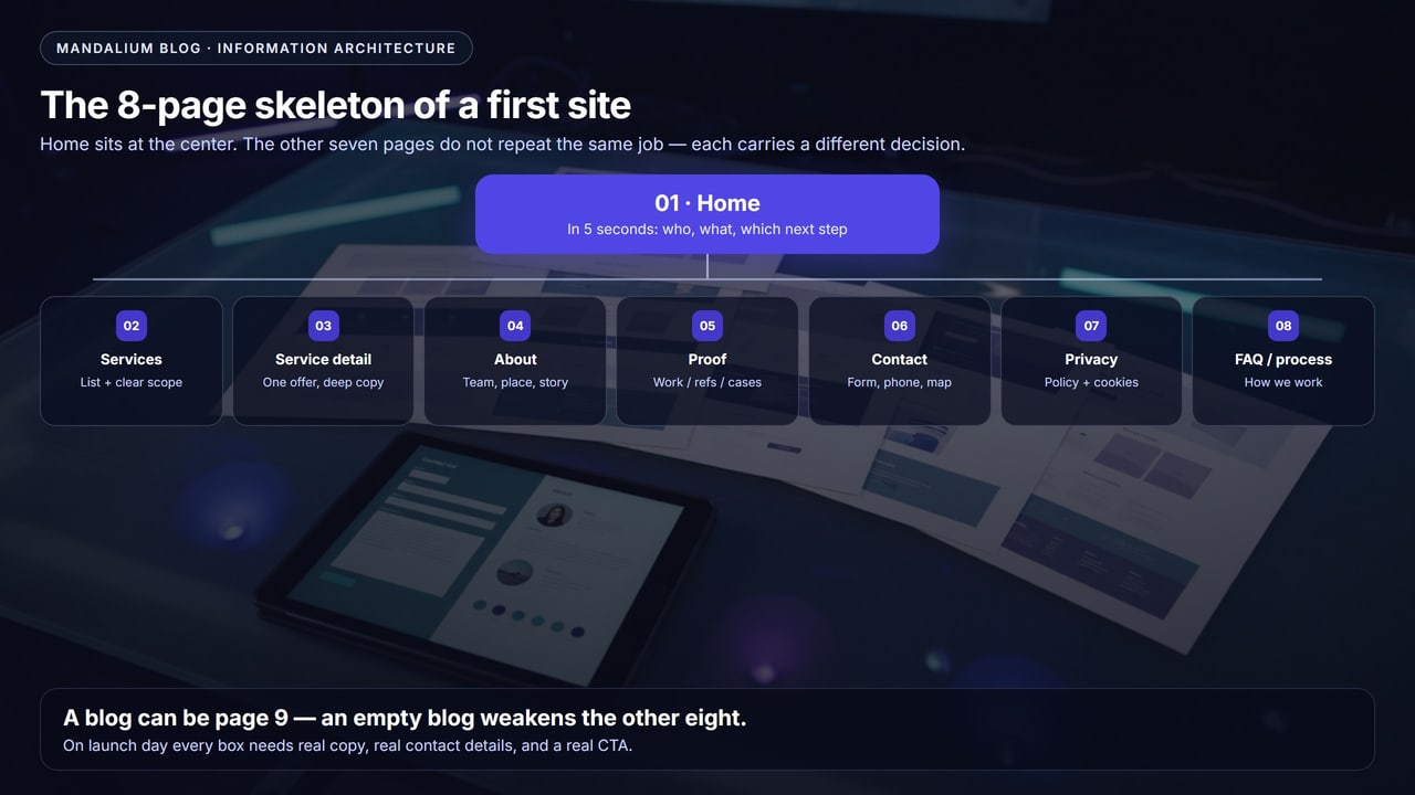
| Page | Job | If left empty |
|---|---|---|
| Home | Who, what, next step | The visitor leaves in 5 seconds |
| Services | A map of scope | “We do everything” |
| Service detail | One intent, a deep answer | No search URL, no quote |
| About | Who, where, why trust | Stock team photo, stock line |
| Proof | Named work or a reference | “Clients coming soon” |
| Contact | Form + NAP + hours | A form only, no phone |
| Privacy | Legal + trust | A form with no notice |
| FAQ / process | How, how much, when | Every lead asks the same 10 questions |
3. The eight pages: what to write, what to skip
1. Home
Home’s job is not to tell everything. It is to orient in 5 seconds. The hero shows who you serve, which problem, which geography, and one CTA. Below that: 3–5 service cards, a proof strip, a short process, a contact path.
Skip: “In today’s dynamic world…,” a 6-slide slider, 12 vanity stats, and a repeat of every nav link. Professional design here is offer clarity, not theme aesthetics.
2. Services (or products)
This page is a list, not a catalogue novel. 4–8 services, one sentence of scope on each card, a “details” link. “Any renovation / any software” is not a card — it is a leak.
3. At least one service-detail page
Do not ship 20 thin pages. Ship one deep page for the offer that wins. Examples: “villa renovation in Manisa,” “SME corporate website,” “CNC job-shop turning.” On the page: who it is for, scope, process, delivery, common objections, one CTA. The list is for scanning. The detail is for a decision.
4. About
Who you are, where you work, why pick you. A real photo of the founder or the team, a short story, the service area. As on Mandalium: the real delivery model, not a “50-country office” claim. A stock office photo and “we are customer-focused” do not fill this page.
5. Proof: portfolio, references, or a case
One job, one name, one outcome. A logo strip is not proof on its own; “coming soon” is not proof at all. If you are new, a sector, a process photo, or a first-customer sentence is enough — do not open an empty page.
6. Contact
Form + tappable phone + address + hours. A map or directions. WhatsApp can be a CTA; it should not be the only channel. NAP (name, address, phone) must match your Google Business Profile exactly. A conflicting address quietly kills local search.
7. Privacy
If you run a contact form, cookies, or analytics, you need a notice. Put the legal name, address, and data controller on a real template. A footer “Privacy” link is not a substitute for the page. At Mandalium this lives at Privacy — it is not a “we will add it later” item on a first release.
8. FAQ or process
The 6–10 questions a buyer asks before a sales call: timeline, price range or “how you price,” revisions, what is delivered, who does the work, whether you show up on site. This page raises lead quality. An empty FAQ (“Question 1 / Answer 1”) is worse than none.
4. The 4 areas you should never leave empty
Pages on the sitemap do not mean the site is full. The four areas below sit inside the templates. If you close them with lorem, stock copy, or “coming soon,” all eight pages still behave like a storefront.
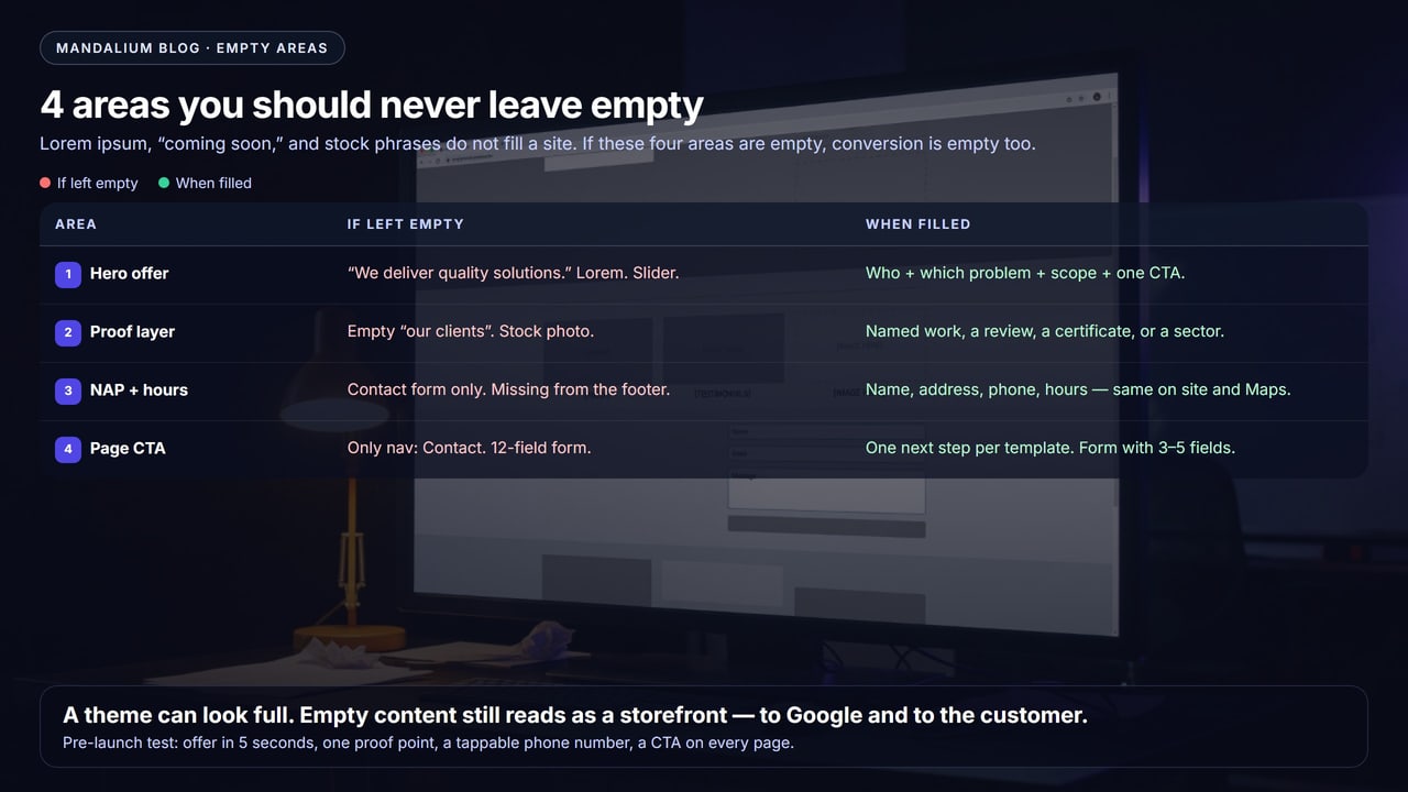
| Area | If left empty | When filled |
|---|---|---|
| Hero offer | “We deliver quality solutions.” Slider. Lorem. | Who + which problem + scope + one CTA |
| Proof layer | Empty “our clients.” Stock photo. | Named work, a review, a certificate, or a sector |
| NAP + hours | Form only. No phone in the footer. | Name, address, phone, hours — same on the site and Maps |
| Page CTA | Only nav: Contact. 12-field form. | One next step per template. Form with 3–5 fields |
- Slogan in the hero, no offer
- Service card: “call for details”
- Phone is an image, not tappable
- 8–12 field form, no privacy checkbox
- “Blog” in the nav, no posts
- Hero: who / what / CTA
- At least one deep service URL
- One named job or review
- NAP matches in footer and contact
- Privacy link next to the form
5. A 20-minute pre-launch check
Mark this list before an agency handover or your own launch. Three “no” answers and the theme can be done while the site is not:
- Does home say who and what you sell in 5 seconds?
- Are seven of the eight pages real copy — or is one “coming soon”?
- Does the phone number start a call on mobile?
- Is the form 3–5 fields, with a privacy tick and a working inbox?
- Does NAP match the Google Business Profile?
- Is a next step visible on every template?
If you already have a site and “the pages exist but they are empty,” the job is not a rebuild from scratch. It is filling the skeleton. That is also where redesign versus rebuild gets decided.
6. Do not put this in the first release
- An empty blog or “posts coming soon”
- 20 thin service pages (the same 80 words, different titles)
- A shop / cart with two products
- A member area, careers, press — with no content
- An English nav with Turkish lorem (or the reverse)
Corporate web design is not “sell more pages.” A first release is few, full, linked pages; then you multiply the URL that wins.
7. Common mistakes
- Writing home as if it were About
- Burying the service detail in a PDF
- A contact page that is only a form, no NAP
- Hiding privacy as “legal” and leaving it off the form
- Filling the proof page with stock mockups
- Leaving the only CTA as Contact in the header
Conclusion: 8 pages, 4 filled areas
Short answer: put 8 pages on your first website and do not leave 4 areas empty. The page list is the skeleton. Offer, proof, NAP, and CTA keep the skeleton standing. A three-page card says “we have a site.” It does not produce search, Maps, or quotes.
Blog, shop, and 20 service URLs come later. On launch day every box needs real copy, real contact details, and a real next step.
At Mandalium we build this 8+4 skeleton first on SME sites, then we multiply the page that wins. Is your first-site skeleton full? Book a free look →
Frequently asked questions
Which pages should a first website have?
Eight pages: home, services, at least one service-detail page, about, proof (portfolio or references), contact, privacy, and FAQ or process. A blog can be page 9; an empty blog weakens the first eight.
What are the 4 areas you should never leave empty?
The hero offer, the proof layer, NAP (name, address, phone) plus hours, and a page-level CTA. A theme can look full; if these four are empty the site is a storefront — Google and the customer see the same gap.
Is a one-page or 3-page site enough for a first release?
As a business card, yes. For search and quotes, no. Service intent needs its own URL. About and contact will not carry queries like price, scope, or “Manisa + service”.
Is a blog mandatory on a first site?
No. An empty “posts coming soon” category does not create SEO; it creates a thin page. If you have no concrete guide to publish, keep the blog out of the first release.
Do I need a privacy page?
If you run a contact form, cookies, or analytics, a privacy/notice page is required in Turkey and expected in most markets. It is also a trust signal. “We will add the legal text later” is a launch-day leak.
Is a services list enough, or do I need a separate detail page?
The list is for scanning. The detail page is for a decision: scope, who it is for, delivery, a price range or process, one CTA. Google and the buyer look for a deep answer on the same URL.

Tugay Mandal
Founder of Mandalium. 6+ years of experience in web design, mobile apps and SEO.
About Us