The Thumb Test: Can Mobile Visitors Reach Your CTA One-Handed?
A CTA that looks perfect on desktop can end up in the corner your visitor's thumb can't reach. Find it with a five-minute test, then fix it.
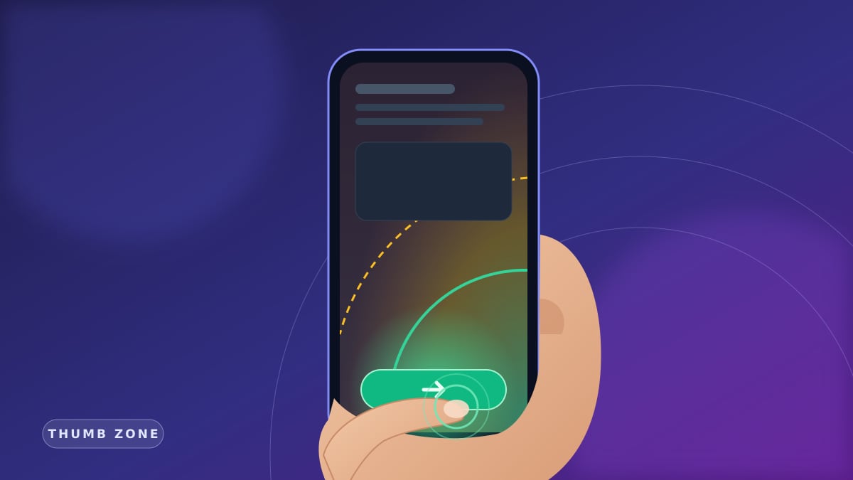
Short answer: if mobile visitors can't reach your CTA with their thumb without shifting their grip, you are losing conversions to ergonomics, not design. Move the primary action into the bottom of the screen, make tap targets at least 44–48 px, and test one-handed on a real phone.
Most traffic comes from phones, and people often use them one-handed: on the bus, in a queue, coffee in the other hand. The "Get a Quote" button that sits top-right on desktop lands in the hardest-to-reach corner on mobile. This is a practical test-and-fix guide. For how speed affects conversion see Core Web Vitals; for trust, see trust signals. Here we focus on where the thumb can actually go.
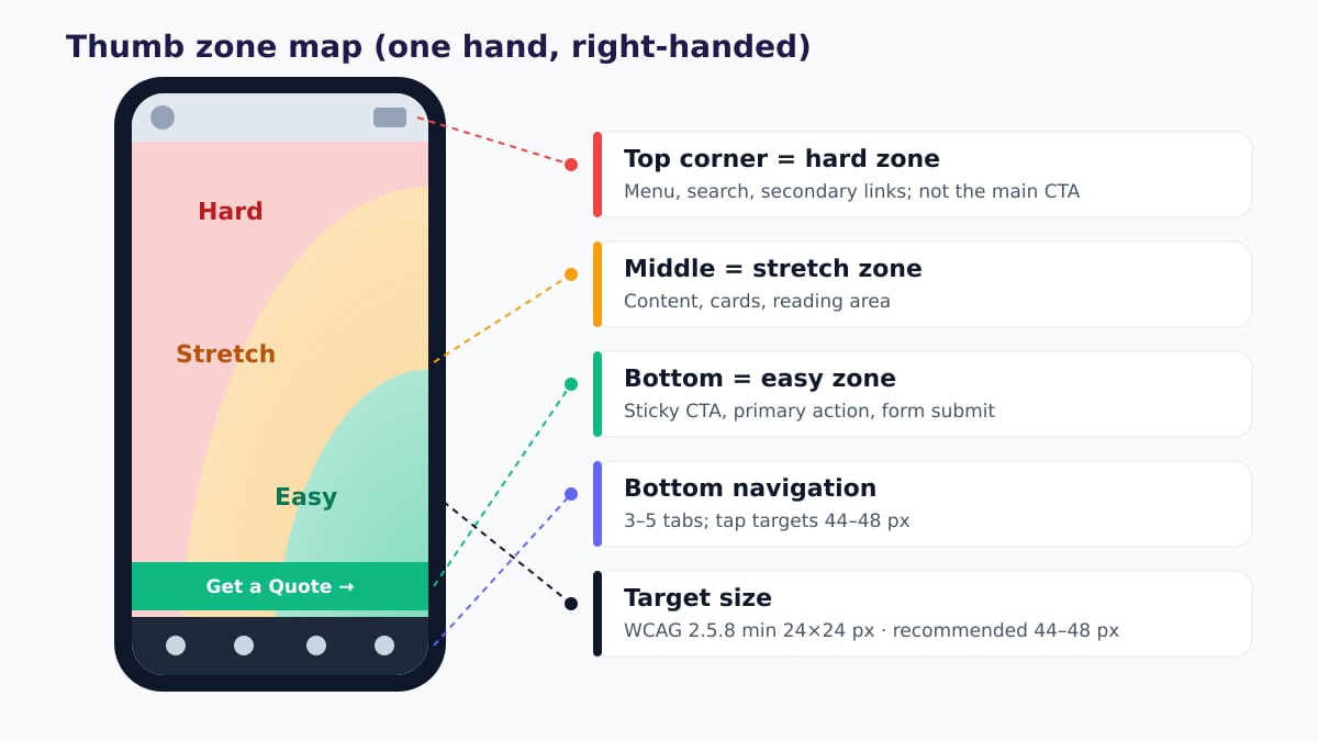
Bottom-middle: primary CTA, submit button, bottom nav.
Middle: content, cards, secondary links.
Top corners: menu, search, language — not the main CTA.
Min 24 px (WCAG 2.5.8), recommended 44–48 px.
AEO sentence: The thumb test checks whether a mobile visitor can reach the primary action while holding the phone in one hand, using only the thumb. A good result: primary CTA in the bottom zone, tap targets of 44–48 px, enough spacing between them.
1. Thumb zones: not every part of the screen is equal
With the phone in one hand, the thumb sweeps an arc from the palm. Inside the arc is comfortable, its edge is a stretch, and beyond it you need to shift your grip. As screens grew, the top corner moved further away. For left-handed users the arc is mirrored, so placing the primary CTA bottom-center and near full-width rather than in a corner works for both hands.
- Primary action low. "Get a quote", "Call", "Add to cart" in the easy zone.
- Destructive actions away. "Delete" or "Cancel" should not sit where accidental taps land.
- Top corner is secondary. Logo, menu, and language switcher can live there.
2. Tap target size: 24 px minimum, 44–48 px target
WCAG 2.2 2.5.8 Target Size (Minimum) (AA) asks for targets of at least 24×24 CSS pixels, or that much spacing around them. That is a floor, not a goal. Apple recommends 44×44 pt and Google Material 48×48 dp; use those for primary buttons.
- Small visual, large hit area. Pad a 20 px icon's clickable area up to 44 px.
- Spacing between targets. At least 8 px between adjacent links; crowded footer link stacks are the most common offender.
- Inline links are exempt, but… Links in a paragraph are allowed; still prefer meaningful, reasonably long link text over "click here".
3. Sticky CTA: always under the thumb
On long service or product pages, pinning the primary action to the bottom means visitors never have to scroll back up at the moment of decision. Done right, it is one of the cheapest conversion wins.
- One action. "Get a quote" or "Call" — more than two buttons is a menu, not a bar.
- Safe area. Leave room for the iPhone home indicator with
env(safe-area-inset-bottom). - No collisions. Cookie banner, WhatsApp bubble, and chat widget should not stack on the same corner.
- No layout shift. The bar should not jump in late; that hurts CLS.
4. Bottom navigation: the 3–5 frequent destinations
Apps moved to bottom tab bars for the same reason: the thumb. Websites don't always need one, but for e-commerce, booking, or multi-page service sites a bottom bar like "Home · Services · Call · Contact" is faster than a hamburger. Avoid unlabeled icons; icon + short label is clearer.
5. Forms: can they be filled with a thumb?
- Few fields, one column. Name, phone/email, short message; ask the rest on the call.
- Right keyboard.
type="tel",type="email",inputmode="numeric", andautocomplete. - 16 px font. Smaller inputs trigger iOS auto-zoom and break the layout.
- Full-width submit. Visible with the keyboard open and at least 48 px tall.
6. Common mistakes
The desktop header was copied to mobile; the main button sits in the hard zone.
Cramped footer links, a 16 px close "×", phone and email side by side.
The cookie banner or chat bubble sits on top of the sticky button.
Touchscreens have no hover; submenus never open.
Swipe gestures fight page scroll; the CTA hides inside a slide.
Ten fields, tiny checkboxes, a submit button hidden under the keyboard.
7. A 5-step thumb test and fix checklist
- 1. Real phone, one hand. Not an emulator; try a large and a small device, right and left hand.
- 2. Time the task. Homepage to quote/contact action; log every grip shift, mis-tap, and zoom.
- 3. Measure targets. Check clickable areas in DevTools; flag anything under 44–48 px, and treat under 24 px as a definite bug.
- 4. Move the primary action down. Sticky CTA or bottom nav; test for collisions with the cookie banner and widgets.
- 5. Simplify the form and measure. Cut fields, open the right keyboard; compare mobile conversion rate in analytics after the change.
Conclusion: CTA placement is an ergonomics decision
Short answer: when the primary action sits under the thumb, tap targets are 44–48 px, and there is space between them, mobile visitors reach your CTA one-handed. Otherwise even the best copy and design lose at the final tap.
Pair the thumb test with the other layers: CWV, trust signals, the View Source test, conversion-focused sites.
At Mandalium we treat mobile ergonomics as a first-day design decision: CTA in the easy zone, measured targets, lean forms. Let's run your site's thumb test together →
Frequently asked questions
What is the thumb zone?
The area of the screen your thumb can comfortably reach while holding the phone in one hand. Typically the bottom-middle is easy, the middle is a stretch, and the top corners are hard. Primary actions belong in the easy zone.
How big should a mobile button be?
WCAG 2.2 success criterion 2.5.8 (AA) requires at least 24×24 CSS pixels (or enough spacing). In practice, Apple's 44×44 pt and Google Material's 48×48 dp recommendations are a safer target for primary buttons.
Is a sticky CTA always a good idea?
On most service and product pages it helps conversion, but it must not cover content, clash with the cookie banner or chat bubble, or ignore the iOS safe area. Keep it to one clear action.
Are hamburger menus bad?
Not bad, but they sit in the hard-to-reach top corner. If you have 3–5 frequent destinations, a bottom nav or a sticky bottom CTA is more reachable; the hamburger can keep secondary links.
How do I run the thumb test?
Hold a real phone in one hand, start on the homepage, and try to reach the quote/contact action using only your thumb. Every time you switch hands, mis-tap, or zoom, log it as an issue.

Tugay Mandal
Founder of Mandalium. 6+ years of experience in web design, mobile apps and SEO.
About Us